How to Make Text Look Handwritten from Typed Words
Typed text and handwritten text look nothing alike, even when the font claims to be a handwriting style. The gap usually comes down to a handful of fixable details: which font you pick, how the letters space themselves, and what the "paper" behind them looks like. Here's what actually makes text look handwritten, and how to get there without redoing everything by hand.
Quick answer: To make text look handwritten, start with a font built for handwriting simulation (ideally one using OpenType contextual alternates so repeated letters vary), loosen and slightly randomize letter and word spacing, use a natural ink color like blue or black, and add light paper texture and margins. A converter tool that handles the spacing, ink, and page styling in one pass, then exports to PDF, saves you from manually tweaking every setting in a word processor.
What you'll learn
- Why standard typed text and even most "handwriting" fonts fail to look convincing
- How to pick a font that actually passes for real handwriting
- The spacing, slant, and baseline details that sell the illusion
- How ink color and paper texture affect realism
- A step-by-step process for converting your own typed text
- Where a handwritten effect is appropriate, and where it isn't
Why Typed Text Never Reads as Handwritten by Default
Standard digital text uses identical glyph shapes every single time a letter repeats. That is the single biggest giveaway that a page was typed rather than written by hand. Look at any two "e"s in a typed paragraph and they are pixel-for-pixel the same. Real handwriting varies letter shape, spacing, baseline position, and slant from one instance of a letter to the next, and standard typesetting does none of that automatically.
Fonts built with the OpenType "contextual alternates" feature (often labeled calt) solve part of this problem. They swap in different versions of a letter depending on its position in a word (start, middle, end) and its neighboring letters. That's why some handwriting fonts look far more convincing than others: the font itself is doing variation work behind the scenes.
Perfectly even right-margin justification and uniform line spacing are also typewriter tells. Handwritten lines drift, rarely align edge to edge, and rarely wrap at exactly the same point twice.
Choosing a Font That Actually Passes for Handwriting
Not every font labeled "handwriting" or "script" is built for realism. Many are decorative calligraphy fonts that still repeat identical letterforms and read as clearly "fonted" the moment you look closely. Google Fonts' Handwriting category alone lists dozens of free options, but quality varies widely: fonts with multiple glyph variants per letter look far more natural than single-glyph fonts.
Matching the font style to the intended pen also matters. Thin, slightly inconsistent strokes read as ballpoint pen, while thicker, more even strokes read as marker or fountain pen. Getting that pairing right does more for believability than picking a popular font name.
If you want the most authentic result possible, you can create a font from your own handwriting. Services like Calligraphr let you write out a set of letters on a template, scan or photograph the page, and generate an installable font file from your own strokes. Once you have that file, most handwriting-effect tools, including Handwriter, let you upload and use it directly instead of picking from a preset list.
Spacing, Slant, and Baseline: The Small Details That Sell the Illusion
Real handwriting has an irregular baseline. Words and letters drift slightly up or down across a line instead of sitting on a perfectly straight rule, the way typed text always does. Letter and word spacing in handwriting is inconsistent too, not the fixed, even spacing of typeset text, so tools that let you adjust or vary spacing noticeably improve realism.
Slight slant variation between letters, rather than one uniform italic angle applied to the whole font, is closer to how a pen actually moves across a page. And line spacing that mimics ruled notebook paper, instead of dense single-spaced paragraphs, reads as more natural for note-style content like letters, journal entries, or cards.
Ink, Paper, and Page Texture
Ink color choice affects how authentic a page looks more than most people expect. Classic blue or black ballpoint tones read as "real pen" far more than pure black digital text does. Ruled line color matters too: light blue or gray lines mimic actual notebook paper, while a plain, unlined sheet mimics printer paper if that's the look you want.
Subtle scanner-style texture and a soft page shadow mimic the look of a physically scanned or photographed document rather than a flat digital export. A slight, natural-looking page rotation, as if the page were photographed at a small angle rather than perfectly flat, is a small but effective realism cue used by handwriting-page tools.
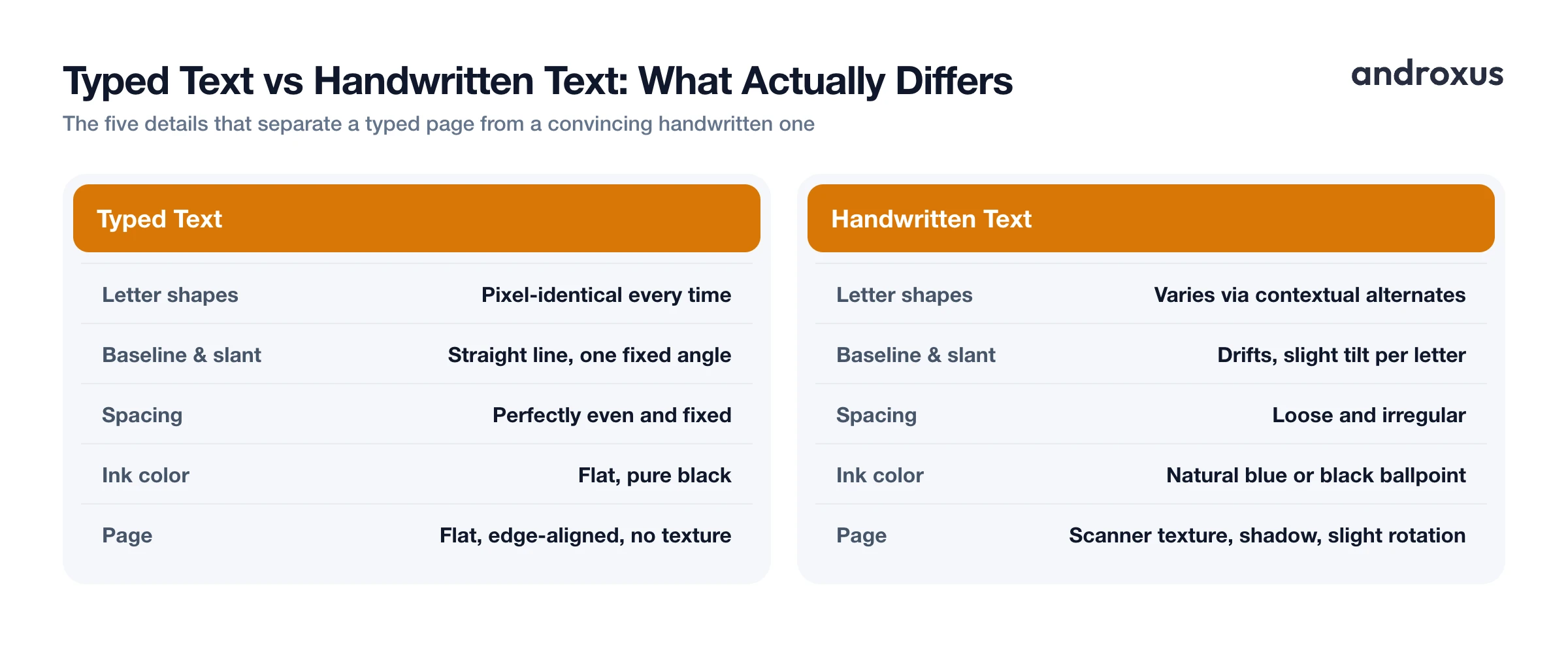
Here's a quick-reference table of what typically breaks the illusion and how each issue gets fixed:
| Factor | Why Typed Text Fails Here | How to Fix It |
|---|---|---|
| Letter shapes | Every instance of a letter is pixel-identical | Use a font with multiple glyph variants or contextual alternates |
| Baseline & slant | Letters sit on a perfectly straight line at one fixed angle | Choose a font or tool that varies baseline position and slant slightly |
| Letter/word spacing | Spacing is perfectly even and fixed | Loosen and vary letter and word spacing |
| Ink color | Pure black digital text reads as printed | Use a natural blue or black ballpoint tone |
| Paper texture | Flat, uniform digital background | Add light scanner texture or ruled/plain sheet styling |
| Page rotation | Perfectly flat, edge-aligned page | Apply a slight, natural page tilt |
Tools That Convert Typed Text into a Handwritten Page
Manually adjusting spacing, ink color, margins, and texture in a word processor or image editor works, but it's slow and easy to get wrong. This is the kind of task a dedicated converter handles faster.
Handwriter, for example, is an Android app that converts typed or pasted text into a realistic handwritten-looking page and exports it as a PDF. It includes 53 free handwriting fonts plus the option to upload a custom font, adjustable margins and letter, word, and line spacing, ink and line colors, plain no-line sheet options, scanner and shadow effects, AI-assisted smart page rotation, and a live preview before you save or share the PDF. It's worth being clear about what it does and doesn't do: it formats text you provide into a handwriting-style page, it does not write or generate the content itself. The words on the page are always whatever text you typed or pasted in.
When a Handwritten Effect Is (and Isn't) the Right Tool
Good uses for a handwriting-style effect include greeting cards, journaling and planner pages, personal notes, social graphics, presentation slides, and teacher worksheets, basically any context where a handwritten feel is a stylistic choice rather than a claim about who wrote it.
A handwriting-style font or converter does not verify who wrote the underlying text, so it should not be used to disguise AI-generated or otherwise non-original writing as personally handwritten work for academic submissions. Imitating a specific person's actual signature or handwriting for identity, legal, or financial purposes is a different act entirely from styling your own text, and it can carry legal or institutional consequences. Because these tools style existing text rather than produce it, the writing and thinking still have to come from the person submitting the work.
How to Make Typed Text Look Handwritten
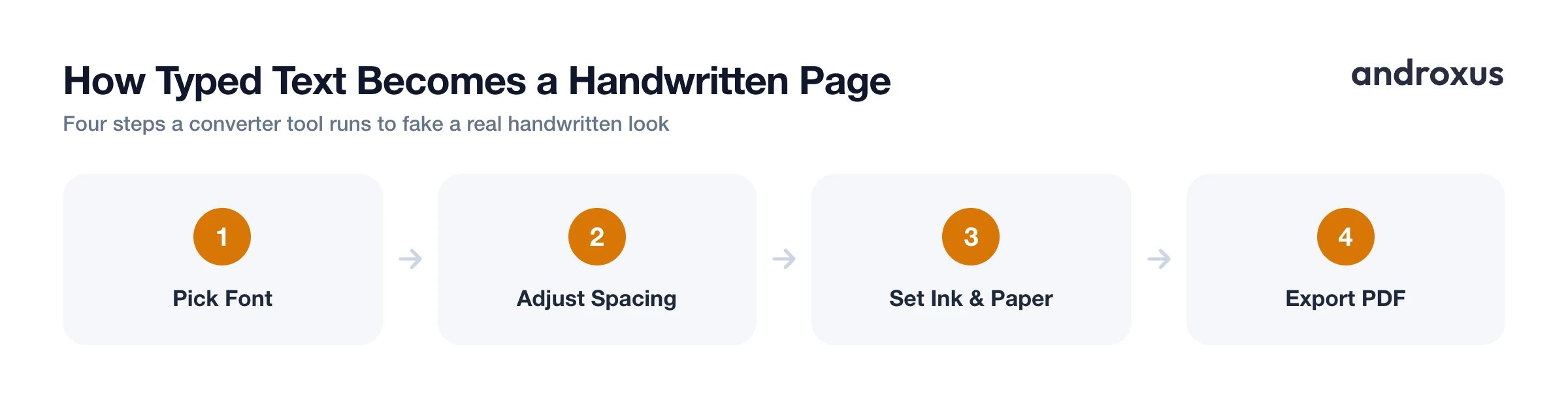
- Choose a genuine handwriting font. Select a font built specifically for handwriting simulation rather than a generic script or calligraphy font. Look for fonts with multiple letter variants or OpenType contextual alternates so repeated letters don't look identical.
- Enter your text. Type or paste the text you want converted. This should be content you've already written, since a handwriting effect changes the visual style, not the authorship, of the text.
- Adjust letter, word, and line spacing. Loosen the default fixed spacing slightly and vary it if the tool allows, since real handwriting never keeps perfectly even gaps between letters and words.
- Set margins to mimic notebook paper. Add a left margin and consistent line spacing similar to ruled paper, or choose a plain, no-line sheet if you want an unlined look.
- Pick ink and line color. Choose a natural ink color such as blue or black ballpoint, and a light gray or blue for any ruled lines, to match how pen and paper actually look.
- Add physical realism effects and export as PDF. Apply subtle touches like a scanner texture, soft page shadow, or slight page rotation so the result reads like a photographed or scanned physical page. Check the live preview, then save or share the finished page as a PDF so the layout and fonts stay intact wherever it's opened.
Key takeaways
- The biggest reason typed text fails to look handwritten is repeated, identical letter shapes, fixed with fonts that vary glyphs contextually.
- Spacing, baseline drift, and slight slant variation matter as much as the font choice itself.
- Natural ink color and light paper texture, plus a slight page rotation, add the physical realism that makes a page believable.
- PDF is the right export format since it preserves layout, fonts, and color everywhere it's opened.
- A handwriting effect styles text you've already written, it doesn't generate content or verify authorship, so it's a formatting choice, not a substitute for original work.
Frequently asked questions
What's the fastest way to make typed text look handwritten?
Pick a genuine handwriting font (not a generic script font), then run your text through a converter that lets you adjust spacing, slant-friendly line height, and ink color, and export the result as an image or PDF. Doing this by hand in a word processor works too, but a dedicated converter like Handwriter automates the spacing and page-styling steps.
Why do handwriting fonts in Google Docs or Word still look fake?
Most built-in handwriting fonts, like Google Docs' default script options, draw every instance of a letter identically, so repeated letters in a word line up perfectly, something real handwriting never does. Fonts built with OpenType contextual alternates (the calt feature) swap in different versions of a letter depending on its position and neighbors, which is what separates convincing handwriting fonts from obviously typed ones.
Can I use my own handwriting as a font?
Yes. Services such as Calligraphr let you write out a set of letters, scan or photograph them, and generate an installable font file from your own strokes. Once you have that font file, most handwriting-effect tools, including Handwriter, let you upload and use it directly.
Is a handwritten text effect the same as forging a signature?
No. A handwritten text effect changes the visual style of body text for things like notes, cards, or journal pages, it does not reproduce a specific individual's signature or handwriting for identity purposes. Using any tool to imitate someone else's signature or handwriting on legal, financial, or academic documents is a separate matter and can be illegal or against institutional policy.
What file format should I use for a handwritten-look document?
PDF is the standard choice because it preserves your exact layout, fonts, and colors across devices and prints reliably, which is why most handwriting-effect apps, including Handwriter, export directly to PDF.
Will a handwriting font effect make an assignment look like I wrote it myself?
A handwriting-style font changes how existing text is displayed, it does not verify authorship, and presenting AI-generated or hand-formatted text as original handwritten work you did not produce can violate academic integrity policies. Tools that convert typed text into a handwriting look are meant for formatting text you've already written, not for producing or disguising the source of content.
