How Do You Convert Text to Handwriting?
Turning typed words into something that looks handwritten is a common request, whether you're making a personalized card, a practice worksheet, or a journal page you want to print. The good news is you don't need any drawing skill for it: a text to handwriting converter does the visual work for you, as long as you already know what you want to say.
Quick answer: To convert text to handwriting, type or paste your content into a text-to-handwriting tool, pick a handwriting-style font (or upload your own), set the paper style, margins, and spacing, then export the result as a PDF. The tool only changes how your existing text looks on the page; it does not write or generate the content for you. Apps like Handwriter handle this on your phone, with a live preview so you can adjust the look before saving or printing.
What you'll learn
- Why people convert typed text into handwriting, and when it's actually appropriate
- What happens technically during the conversion process
- The settings that make a page look genuinely handwritten instead of typed
- How to match fonts and paper style to your specific use case
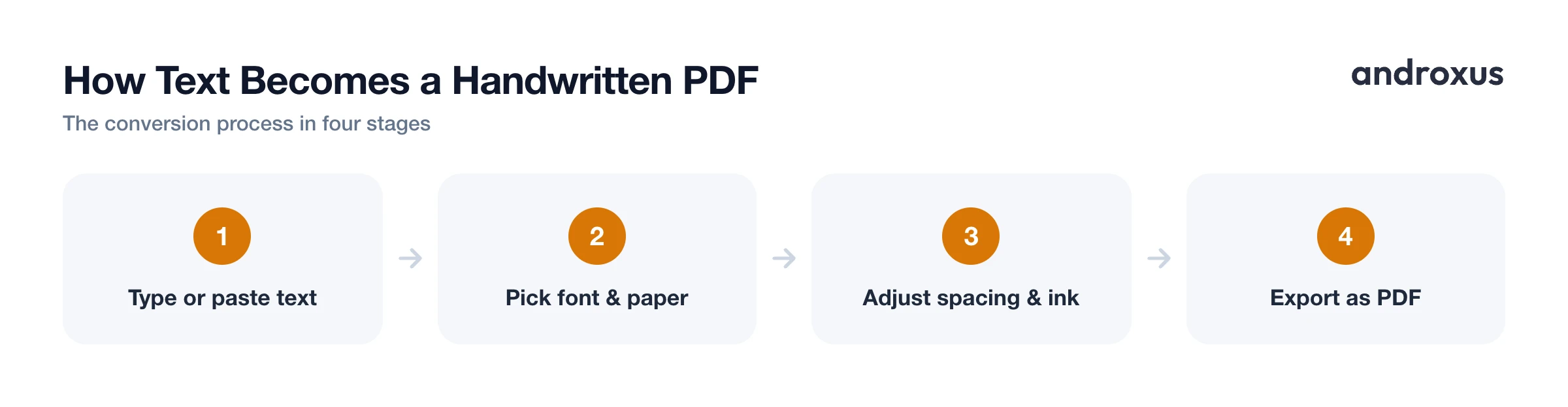
- A step-by-step workflow for converting text into a handwritten-style PDF
Why people convert typed text into handwriting
Most legitimate uses are about presentation, not content. People convert typed text into handwriting to make personalized cards and letters, to keep a journal that feels more personal than a typed document, to build teacher-made worksheets or practice sheets, to design handwritten-style invitations, or simply to reformat notes they already wrote in their own words so they look better on paper.
It's worth being clear about what the tool changes and what it doesn't. A converter changes appearance only. It does not write content, so it cannot do your homework or generate an essay for you; it takes text you already typed or pasted and renders it in a handwriting style.
That distinction matters most for school use. Whether a converted PDF is appropriate for a class assignment depends entirely on your teacher's or institution's rules, not on the tool itself. A converted page is not a substitute for proof of in-class, timed handwritten work. Rules vary by teacher and institution, so when in doubt, the safest move is asking the instructor directly before you submit anything.
What actually happens during the conversion
Technically, the process is closer to normal font rendering than anything mysterious. The app maps each typed character to a matching glyph from a handwriting-style font, the same way any font renders text, just styled to look hand-drawn rather than printed.
From there, a few settings do most of the work of making the page feel natural:
- Adjustable margins and letter, word, and line spacing reproduce the slightly irregular spacing of real handwriting instead of perfectly even typewriter spacing.
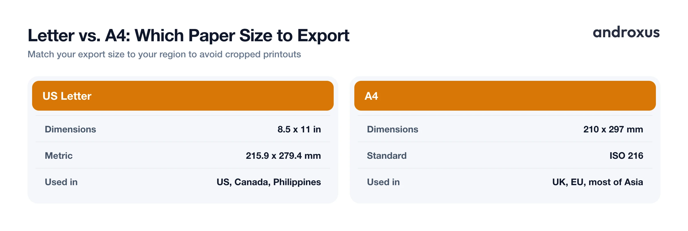
- The finished page gets exported as a fixed-size PDF, commonly US Letter (8.5 by 11 in, or 215.9 by 279.4 mm) or A4 (210 by 297 mm), so it can be printed, saved, or shared like any other document.
- A live preview shows line breaks and pagination before export, which matters because handwriting fonts often take up more or less horizontal space per character than standard typed fonts, shifting exactly where lines wrap.
That preview step is easy to skip but worth using. Since spacing and font choice both affect line breaks, what looks right in a text box can wrap awkwardly once it's rendered onto a page, so checking the preview before exporting saves a redo.
What makes a converted page look genuinely handwritten
Font choice is the single biggest factor in how convincing the result looks. X-height, letter spacing, and stroke variation are the properties that most affect how natural and legible a handwriting-style font appears. A font with too much uniformity, where every repeated letter looks identical, is usually the biggest giveaway that text is typed rather than handwritten. Subtle variation between repeated letters helps sell the effect.
Beyond the font itself, a few other details push a page from "digital text in a script font" toward "photo of a real page":
- Scanner and shadow effects, plus a slight page rotation, mimic the imperfections of a photographed or photocopied sheet of paper rather than a flat digital render.
- Ink color matters more than people expect. Blue or black are the most common and the most believable choices, since they match how most handwritten pages actually look.
- On ruled paper, the line color itself needs to look believable too. Lines that are too stark or too saturated read as digital rather than printed notebook paper.
Choosing fonts and paper settings for your purpose
Different situations call for different combinations of font, paper, and color. Neat, evenly spaced handwriting fonts work best for worksheets and study notes meant to be read quickly and clearly. Looser, more casual or cursive-leaning fonts fit personal letters, journal entries, and greeting cards, where personality matters more than uniform legibility.
Paper style follows a similar logic: ruled (lined) paper reads as notebook or assignment paper, while plain no-line sheets suit cards, letterhead-style notes, and journaling layouts. Paper size should match your audience's region, since printing at the wrong size crops content or adds odd margins.
| Use Case | Recommended Font Style | Paper Style | Ink Color | Notes |
|---|---|---|---|---|
| School worksheet | Neat, even | Ruled | Blue or black | Keep spacing consistent for legibility |
| Personal letter | Casual, cursive-leaning | Plain (no-line) | Blue or black | Add a scanner effect for realism |
| Greeting card | Decorative, cursive | Plain (no-line) | Black or colored | Slight page rotation adds a natural feel |
| Journal page | Casual, loose | Ruled or plain | Blue or black | Vary spacing slightly for authenticity |
| Teacher handout | Neat, even | Ruled | Black | Use Letter (US, Canada, Philippines) or A4 (most other regions) |
Converting text to handwriting on your Android phone
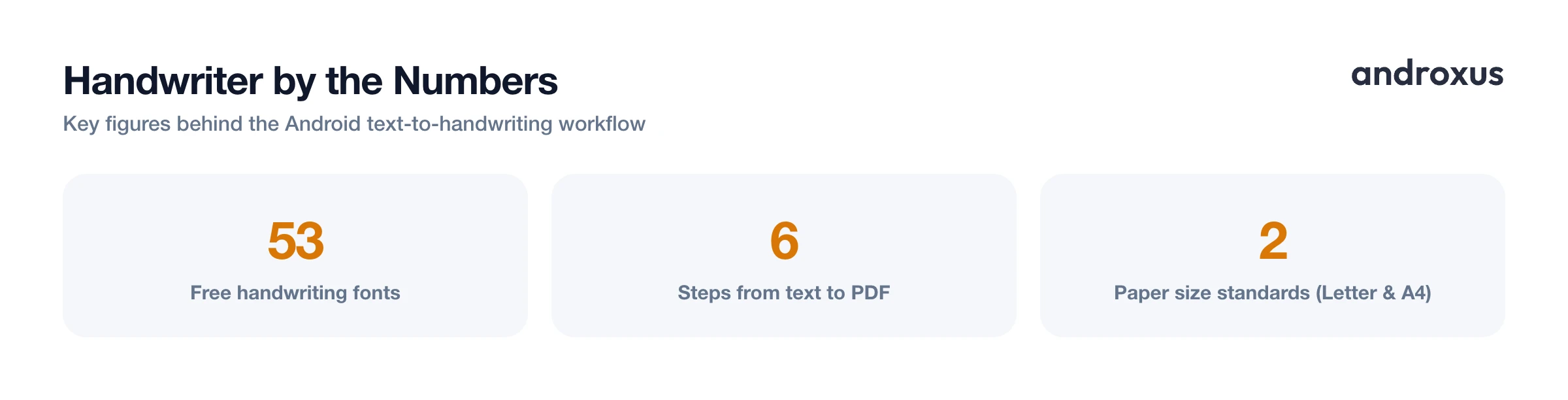
The core workflow on Android is short: type or paste your text, choose a font, set paper and spacing, preview the result, and export as a PDF. Handwriter is built around exactly that sequence. It offers 53 free handwriting fonts plus the option to upload a custom font, adjustable margins and letter, word, and line spacing, ink and line colors, plain no-line sheets, scanner and shadow effects, AI-assisted page rotation, a live preview, and the ability to save or share the finished PDF, all on-device without needing a desktop app.
Because everything happens in one pass with a live preview, it's easy to compare a few font and spacing combinations before committing to a final export, which is usually the fastest way to land on a result that looks right for your specific use case.
How to Convert Typed Text into Handwriting
- Type or paste your text. Enter the content you want converted, or paste it in from notes, an email, or a document. The tool only reformats existing text, so write or finalize your content first.
- Pick a handwriting font. Choose a style that fits the purpose, neat and even for schoolwork, looser and more casual for personal notes. Handwriter offers 53 free handwriting fonts, or you can upload a custom font to match your own handwriting.
- Choose paper style and margins. Select ruled paper for a notebook look or a plain no-line sheet for cards and letters, then adjust margins so the text sits naturally on the page.
- Adjust letter, word, and line spacing. Fine-tune spacing so it looks slightly uneven rather than perfectly uniform, since that's one of the biggest factors in a convincing result.
- Set ink color and add realism effects. Pick blue or black ink for a realistic look, and turn on scanner or shadow effects with slight page rotation to mimic a scanned physical page.
- Preview and export the PDF. Check the live preview for line breaks and page count, adjust font size or spacing if anything looks cramped, then save the finished page as a PDF and share or print it.
Key takeaways
- Converting text to handwriting changes how existing text looks; it does not write, generate, or edit the content itself, so you still have to compose the text yourself.
- Font choice, spacing, and subtle imperfections like scanner effects and slight page rotation matter more than any single setting for a convincing result.
- Match your font and paper style to the use case: neat and ruled for worksheets, casual and plain for letters and cards.
- Always export at the correct paper size, Letter for the US, Canada, and the Philippines, and A4 for most other regions, to avoid cropped or misaligned printouts.
- For school assignments, formatting choices don't override your teacher's rules; when in doubt, ask before submitting a converted page.
Frequently asked questions
Can a text-to-handwriting converter write my essay or homework for me?
No. These tools reformat text you already typed into a handwriting-style appearance. They do not generate ideas, sentences, or answers. You still have to write the content yourself; the app only changes how it looks on the page.
Is it appropriate to submit typed-then-converted handwriting for a class assignment?
It depends entirely on your teacher's or institution's rules, not on the tool. If the assignment requires proof of handwritten work, like a timed in-class exercise, a converted PDF is not a substitute. If it's simply about formatting a take-home worksheet you wrote yourself, check first; when in doubt, ask the instructor before submitting.
Should I export as Letter or A4 paper size?
Use US Letter (8.5 by 11 inches, about 216 by 279 mm) if you're printing in the United States, Canada, or the Philippines. Use A4 (210 by 297 mm, the ISO 216 standard) almost everywhere else, including the UK, EU, and most of Asia. Printing at the wrong size can crop content or leave odd margins.
Can I use my own handwriting instead of a built-in font?
Some converters, including Handwriter, let you upload a custom font file so the output matches your own handwriting rather than a generic style. If you don't have one, picking from a library of preset handwriting fonts is the faster option.
Does ruled paper look more realistic than plain paper?
Ruled or lined paper reads as more notebook-like for notes and assignments, while plain no-line sheets suit cards, letters, and journaling. Realism comes less from the lines themselves and more from natural-looking spacing, subtle stroke variation, and a slight page rotation or scan effect.
Will the converted PDF keep my paragraph breaks and spacing?
Yes. As long as the tool lets you control letter, word, and line spacing plus margins, your original structure, including paragraphs and line breaks, carries over into the handwritten-style layout instead of being flattened into one block.
