How Do Realistic Handwriting Fonts Actually Work?
Look closely at most "handwriting" fonts and you'll spot the tell: the same letter, drawn the exact same way, over and over across a page. Real handwriting never does that. The fonts that manage to fool the eye are doing something more deliberate under the hood than simply tracing a script in a cursive typeface.
Quick answer: Realistic handwriting fonts work by combining multiple drawn variants of each letter, OpenType substitution rules that automatically pick which variant or connecting form to use based on context, and small irregularities in baseline position and stroke width. A font with only one shape per letter looks robotic the moment a word repeats a character; a font with 3 or more variants per letter, wired up with contextual alternates, avoids that pattern and reads as genuinely handwritten.
What you'll learn
- What separates a convincing handwriting font from an obviously digital one
- How the OpenType feature behind the scenes actually swaps letterforms as you type
- Why repeated letters are the hardest problem for font designers to solve
- What a converter adds on top of the font itself to sell the illusion
- How to pick the right handwriting font and export it so it looks the same everywhere
What "realistic" actually means in a handwriting font
A font only looks handwritten if it avoids the single most obvious sign of digital type: identical repeated letters. Real handwriting never draws the same letter the same way twice, even within the same word, because a hand in motion never repeats a stroke with pixel-perfect precision.
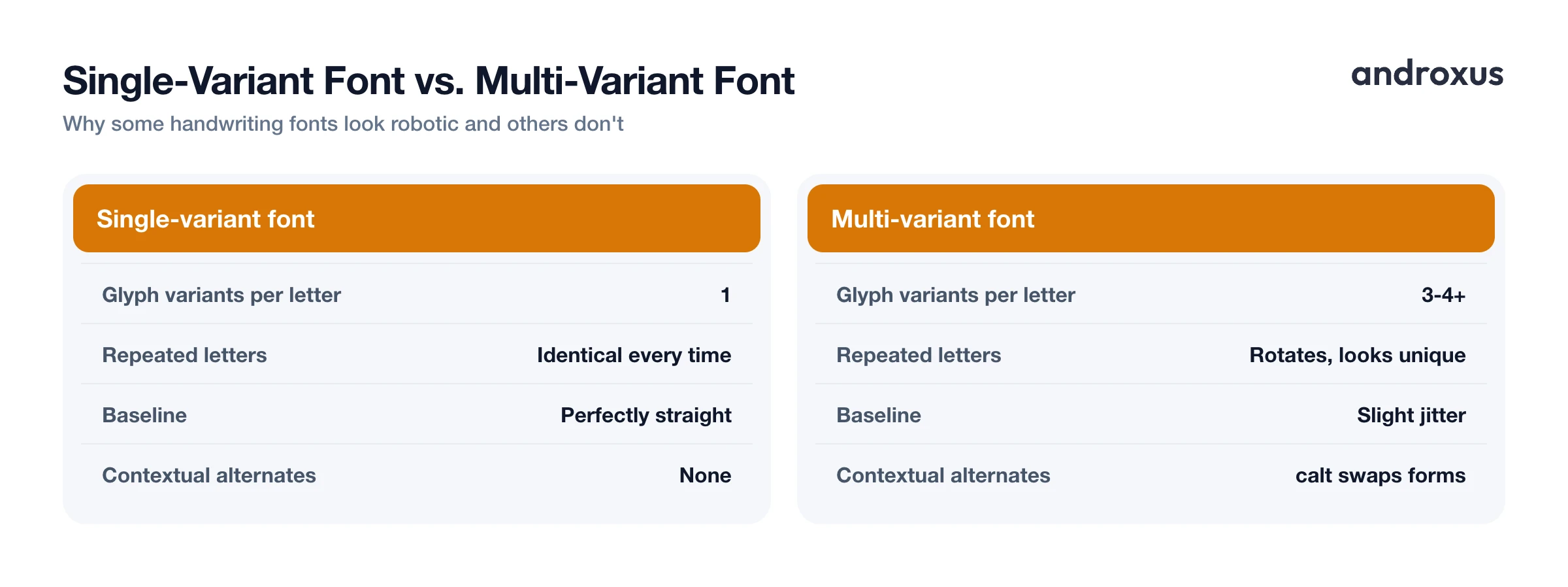
Realistic handwriting fonts combine three ingredients to fake that variation. First, multiple glyph variants per letter, meaning the letter "a" might exist as two, three, or more separately drawn shapes inside the same font file. Second, automatic substitution rules that decide which variant to display each time that letter appears. Third, subtle irregularity in baseline position and letter size, so the line of text doesn't sit in a perfectly straight, ruler-drawn row.
Well-built handwriting fonts typically include 3 to 4 versions, often more, of common letters that rotate automatically as you type, so the same letter looks slightly different each time it shows up. The better ones also let letters sit slightly above or below the baseline and vary stroke width subtly, mimicking how pen pressure changes as a hand moves across a page.
The technical trick: OpenType substitution
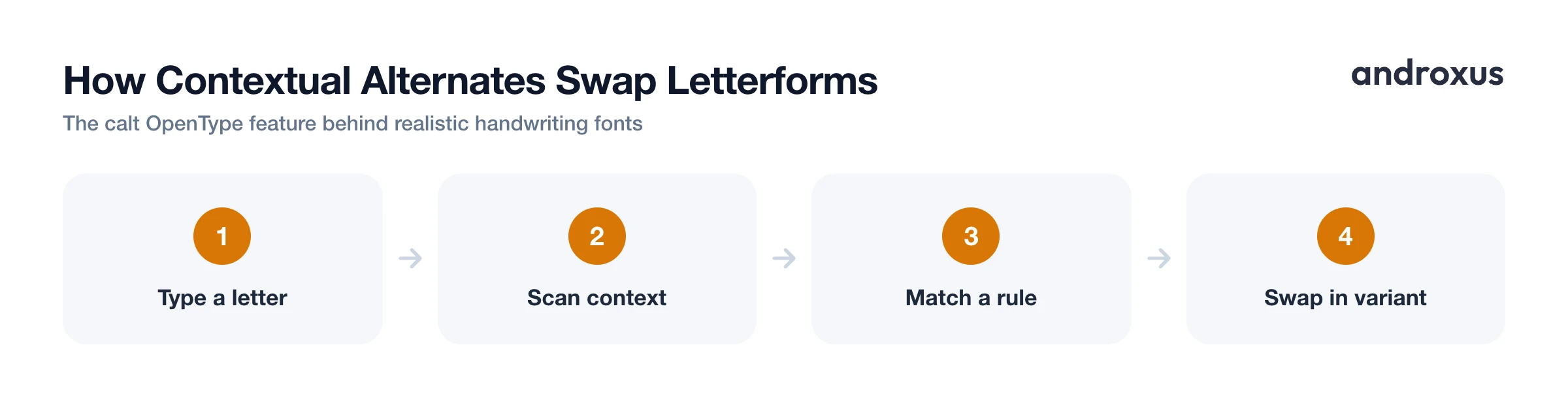
The mechanism that makes this rotation possible is an OpenType feature called Contextual Alternates, usually labeled calt in font software. It swaps a letterform for a different drawn version depending on the characters next to it or its position within a word, the same way a spell-checker's substitution logic works, except here it's substituting shapes instead of words.
In practice, the feature behaves like a small set of rules baked into the font file. It scans each glyph in context and swaps in an alternate whenever the surrounding letters match a pattern the type designer defined ahead of time. Designers commonly build rotating lookups: the first time a letter appears it uses variant one, the next occurrence nearby switches to variant two, and so on, so two instances of the same letter close together don't look identical.
Ligatures work on the same underlying mechanism but solve a different problem. A ligature merges two or more letters into one drawn shape at a common joint, like "th" or "ing", to imitate the connected pen strokes you'd see in cursive or joined handwriting rather than isolated printed letters bumping up against each other.
How handwriting fonts simulate real writing
| Font-design technique | What it does | What it imitates in real handwriting |
|---|---|---|
| Multiple glyph variants | Rotates 3 or more drawn shapes per letter | Avoids identical repeated letters |
| Contextual alternates (calt) | Chooses word-start, middle, or end forms automatically | Natural letter connections |
| Ligatures | Merges letter pairs into one joined shape | Connected pen strokes in cursive |
| Baseline jitter | Shifts individual letters slightly up or down | The uneven line a moving hand produces |
| Stroke-width variation | Thickens or thins parts of a letter | Changes in pen pressure |
| File format (TTF vs. OTF) | Different ways of storing the outlines | No effect on realism, purely a storage detail |
Why letter repetition is the hardest problem to solve
Many basic handwriting fonts still contain only one drawn shape per character, which is exactly why longer words with repeated letters, think "letter" or "apple", give them away at a glance. Once you notice that every "t" or every "p" is identical, the illusion collapses no matter how nice the individual letterforms look.
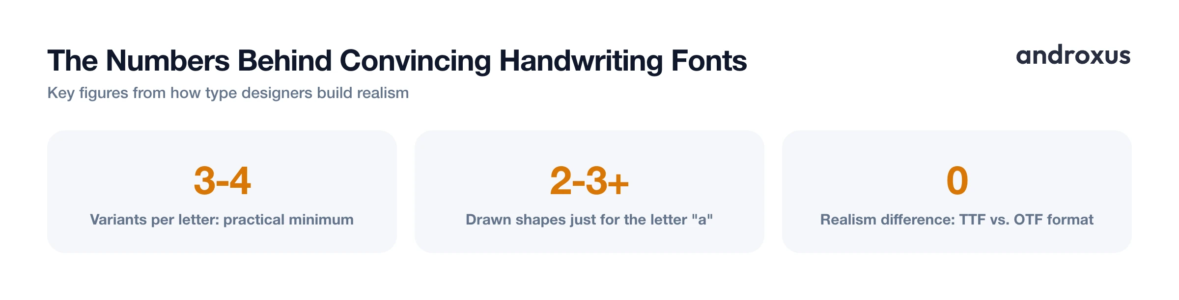
Type designers generally treat 3 to 4 variants per letter as a practical minimum for convincing results, and pushing that number higher for common letters like e, a, and s tends to matter most, since those show up repeatedly in ordinary text. More variants combined with more substitution rules produce a noticeably more natural, less mechanical result.
The reason quality varies so widely between free and premium handwriting fonts comes down to labor: building and coding that many variants takes real design time. Some handwriting fonts are essentially a single traced alphabet dressed up as a font, while others are built from dozens of scanned pen strokes per letter, which is a much bigger undertaking.
What a converter adds on top of the font
The font supplies the letterforms, but getting a page that reads as handwritten involves more than font choice alone. Margins, letter and word and line spacing, ink color, and whether the page has ruled lines or is left plain all shape how convincing the final result looks, independent of which font is doing the drawing.
Apps like Handwriter apply scanner and shadow effects and automatic page rotation on top of the chosen font so the output resembles a page that was photographed or scanned rather than flat, perfectly aligned digital text. This layer matters because even a well-built handwriting font can look synthetic when it's perfectly centered, perfectly straight, and rendered at uniform digital contrast. A slight tilt or shadow does a lot of work toward completing the effect.
It's worth being precise about what this kind of tool actually does: it converts text you already have into a handwriting-styled page and exports it as a PDF. It formats existing writing; it doesn't generate or compose the content for you, so whatever you type or paste in is what ends up on the page.
Choosing the right font for the job, and when not to bother
A casual note or greeting card benefits from a looser, more irregular font with plenty of variant letters. Something meant to look like neat schoolwork or a formal message generally reads better with a more upright, consistent handwriting font that leans less heavily on chaotic variation.
You can also build a font from your own handwriting using dedicated services that turn a filled-out letter template into a TTF or OTF file. That's a separate process from formatting typed text onto a page, and a converter can typically let you upload a custom font like that alongside its built-in library.
Handwriting fonts, however convincing, are widely available and easy for anyone to download, which is exactly why they're not a substitute for an actual signature on legal or official documents. E-signature laws such as the U.S. ESIGN Act govern consent and intent, not how authentic a font looks on the page, so realistic handwriting is a stylistic choice for personal or creative use, not a legal shortcut.
For PDFs meant to be viewed or printed elsewhere, embedding the font in the file, or subsetting it so only the characters actually used get embedded, keeps the handwriting appearance consistent. Without that, a PDF viewer substitutes a different font whenever the original isn't installed on the device opening it, and the handwritten look can shift or disappear entirely.
How to get a convincing handwritten look from typed text
- Start with your actual text. Type or paste the text you want to appear handwritten. A converter formats existing writing into a handwriting look; it doesn't compose the content for you.
- Pick a handwriting font that matches the tone. Choose a font suited to the context: casual and loose for a personal note, neater and more upright for something meant to look like careful schoolwork or a formal card.
- Adjust spacing and margins. Set letter, word, and line spacing along with page margins so the text sits the way real handwriting would on a page, not stretched or cramped like default typed text.
- Set ink and page style. Pick an ink color and choose ruled or plain (no-line) paper depending on whether the result should look like notebook paper or a blank sheet.
- Add realism effects. Apply scanner and shadow effects, and let automatic page rotation correct the page angle, so the final image reads like a photographed or scanned handwritten page rather than a flat digital render.
- Preview, then export. Check the live preview for repeated-letter patterns or spacing issues, then save or share the finished page as a PDF.
Key takeaways
- Realistic handwriting fonts rely on multiple drawn variants per letter plus OpenType contextual alternates that pick which variant to show, not on a single traced alphabet.
- Repeated letters in the same word are the fastest way to spot a weak handwriting font; 3 or more variants per common letter is the practical threshold for convincing results.
- Baseline jitter and subtle stroke-width variation matter as much as the letterforms themselves, since a perfectly straight, uniform line reads as digital no matter how nice the font is.
- Page-level details, spacing, margins, ink color, scanner and shadow effects, and slight rotation, finish the illusion that the font alone can't fully deliver.
- Handwriting fonts are a great fit for notes, cards, and creative projects, but they're not appropriate for signing legal or official documents, since anyone can download the same font.
Frequently asked questions
What actually makes a handwriting font look real instead of robotic?
Three things together: multiple drawn variants of each letter so repeats don't look identical, OpenType substitution rules (contextual alternates) that pick connecting or word-position forms automatically, and small baseline or size jitter so letters don't sit in a perfectly straight, uniform row.
How many variants of each letter does a realistic handwriting font need?
Type designers generally aim for at least 3 to 4 drawn variants per common letter, with more for high-frequency letters like e, a, and s. Fewer than that and repeated letters in the same word tend to look identical, which is the fastest way to spot a font.
What's the difference between a script font and a handwriting font?
Script fonts are typically formal, calligraphic designs, think wedding invitations, with consistent, polished strokes. Handwriting fonts are modeled on casual pen or pencil writing and lean on irregularity, baseline wobble, and varied letter connections to look like an actual person wrote them.
Can I turn my own handwriting into a font?
Yes. Services exist that let you fill out a template of your letterforms and generate a custom TTF or OTF font from it. That's a separate process from formatting text into a handwriting-style page; a converter like Handwriter uses existing fonts, including ones you upload, rather than creating a font from a handwriting sample.
Does it matter whether a handwriting font is a TTF or OTF file?
Not for how realistic it looks. TTF (quadratic outlines) and OTF (cubic outlines, often OpenType/CFF) are just different ways of storing the same letterforms; realism comes from how many variants and substitution rules the designer built in, not the file format.
Is it appropriate to use a handwriting font for a signature on a legal document?
Widely available handwriting fonts are fine for cards, notes, and casual use, but they're generally not recommended for signing legal or official documents, since anyone can download the same font. Legitimate e-signatures rely on consent and audit trails, not on how authentic the font looks.
